A brand is more than a logo or word-mark
Issue 11: Pushing back a little on criticisms of homogenization in modern brand design
I love a good logo, a thoughtfully designed word-mark, and playful use of whitespace as much as the next designer. Designers often pride themselves on being both highly detail-oriented, and being able to zoom out and think about the bigger picture, the audience, and their context.
At the same time, I’ve noticed a streak of designers pushing back against what’s perceived as the homogenization and modernization of design, whether it’s word-marks, logos, cars, or park-benches.
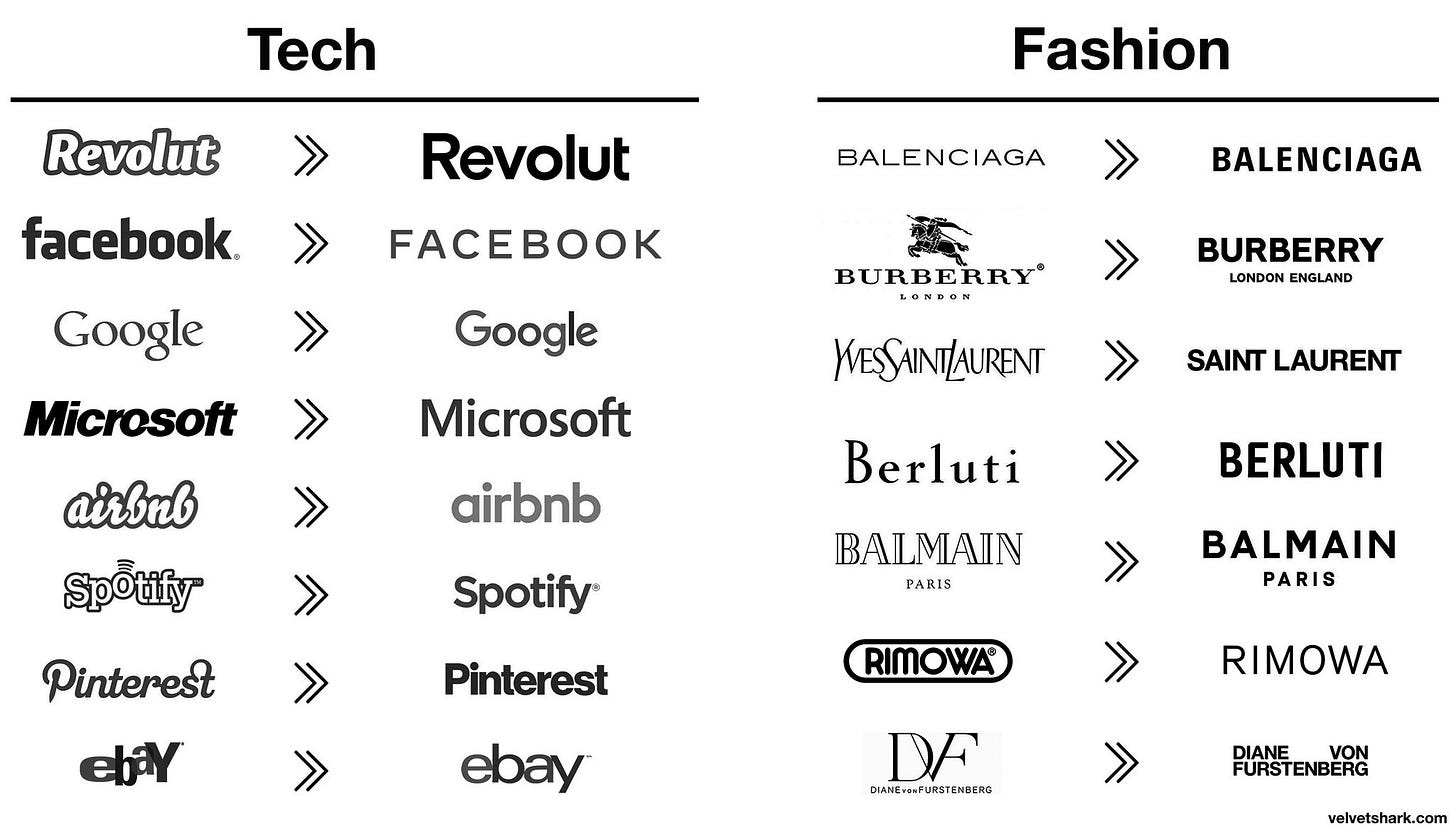
You may be familiar with this graphic below, or at least recognize the sentiment it conveys.
The intent is to show a homogenization, and the removal of character, playfulness and a sense that each brand is a unique snowflake across tech and fashion companies. It tells a compelling story in a simple and effective way, and it does this by conveniently ignoring what actually matters in a brand.
In my opinion, a brand is a mixture of context, color, application, experience, and perception (among other things, not an exhaustive list).
If we add logos and color back into the mix for some of the tech companies, the similarities, while still there, become a little less important overall. No one would mistake one of these brands for another.
The lack of attention to detail in these broad critiques is also frustrating. Simple and modern doesn’t automatically equate to lazy or basic. If you zoom into any of these logos, you’ll find variety and difference in the small details if you look with a critical eye. Sans-serif fonts are a huge bucket, and while we can deride their similarities, we should also celebrate their differences.

Equally important is how these logos are applied alongside other brand assets, colors, composition, motion design, product photography, and art direction.
How they translate into 3D spaces, how they are integrated with architecture, lighting, textures & materials enables more avenues for brand expression, and often elevates the perception of a brand over time and exposure, even if the logo fades somewhat into the background.
Burberry’s incredible Open Spaces ad is evocative well before the logo is shown on white right at the end, and ultimately the logo barely matters in this context. People know what brand it is, and that’s what’s important.
On the flip side, it also didn’t matter what font the Burberry logo used when for a short time, their brand became synonymous with burning unused stock, or when Facebook broke democracy, or when Balenciaga seemingly endorsed the sexualisation of children. These things also define brands and how they’re perceived.
“Your brand is what other people say about you when you’re not in the room”
- A man with a garbage personal brand.
What both fashion and tech brands share, is a need to constantly reinvent themselves and appear modern rather than dated. Fashion brands embrace their heritage often by reinventing it, rather than just re-using it as-is. The fashion world lives on trends, and we shouldn’t be surprised when they follow them. This period of modernism will probably cycle out eventually, as brand sentiment changes and a shake-up is needed.
An example out of left field
Consider these two logos below.
With color and context stripped away, they appear extremely similar. They share exactly the same properties, a bat symbol cut out of an oval shape, wings extending upwards over two pointed ears, 5 points representing the tail and webbed wings of a bat.
But these logos are from two very different eras of Batman, and only represent a tiny part of their respective Batman brands. When you see them in context, the tones couldn’t be more different.
The writing, the illustration style, the color palette, the type treatments, the overall perception of their audience is entirely different. One’s a goofy Saturday-morning cartoon, the other a dark series that often focusses on the villains of Gotham. We get none of that difference when we’re reductive in our comparisons.
Conclusion
So look, I understand the very natural urge to dunk on logos when they’re presented without context or given any time to prove themselves. I get leaning into the very human biases around pattern-recognition, and highlighting similarities while ignoring differences if it suits our narrative. I’ve been the designer who’s taken the cheap shot of dunking on a logo because it vaguely resembles a swastika made of dicks. I’m not better than that.
But I’d like to attempt to be better over time. I’d like to encourage everyone, especially every designer who claims to be detail-orientated or context-aware, to take a beat, and let new logos and rebrands have a chance to prove themselves with their applications and context.
Be critical of modernism if you like, there is plenty to be critical of, but look beyond surface-level hot-takes, and try not to omit inconvenient details, and don’t forget that the designers who work on these brands are people, working under constraints that are invisible to you and me.
Elsewhere
Anthony Hobday tweeted a thread which looks for thoughtful details in the very stripped-back, modernist Campsite homepage. It felt relevant and worth a mention.
Thanks to Design Systems Batman on Twitter for unintentionally helping solidify some of my thoughts on this topic.
Fabian Arbor is a designer who frequently posts modern speculative redesigns of iconic logos on Twitter. I enjoy his attempts and process, even if I don’t always agree on the direction.


