

How to deprecate old components in Figma design systems
How to deprecate old components in Figma design systems
A strategy to help ease some of the pain and confusion when deprecating unwanted components from your Figma design system.

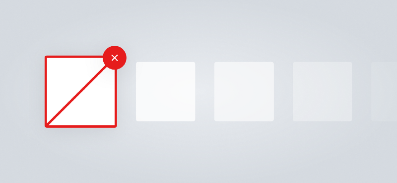
In Figma, if you delete a component from a shared library, every instance of that component in any designs you’ve used it in will link to the last history point that the component existed.
This is great because your designs are very unlikely to break due to components being removed.
This is terrible because deleted components are completely invisible and really hard to detect in more complex designs.
I offer you today, not a solution… (the tools need to implement proper version management for that), but a strategy that may help ease some of the pain and confusion when deprecating unwanted components.
Note: while this is written for Figma users, a lot of this will be useful for Sketch users also. We’re all friends here.
A real-world example
When first creating Onfido’s design system in Figma, I wanted to try and achieve more flexibility, and give designers more options than our Sketch libraries at the time had support for.
One example was making sure that states (Normal, Hover, Pressed, Focus) for every component were well defined, and easily switchable per-instance.
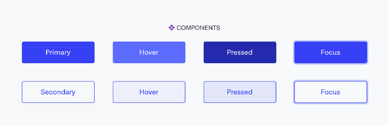
Over the course of a few months, as we evaluated Figma and built out more and more components, it became clear that multiplying our master components by 4 actually just made it really hard to find a button when you searched your assets panel for ‘button’.
We made this architectural decision with good intentions, but in Figma you really need to understand what workflows you’re optimizing for. In hindsight, state was used pretty infrequently and was the wrong thing to make efficient.
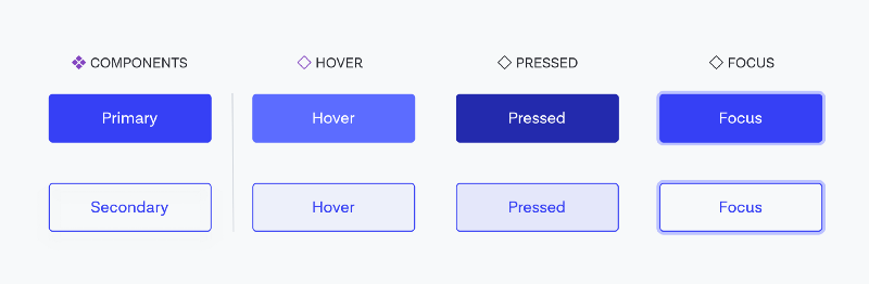
We decided on a middle ground between flexibility and efficiency. We’d keep the Normal state as a master component that could be searched for using the assets panel, but convert all the other states into instances in the design system with the appropriate overrides set. This means if you search for a button component, you‘re only shown the main variants, but if you want a specific state, you can simply click the ‘Edit master component’ button and copy/paste the instance you want to use in your design.
To get there, we needed to delete 6 old components and replace them with these instances. So what can we do to ensure people notice these removals and swap out the components where needed?
1. Make deprecated elements visible
When the core problem is deprecated components not being visible, the obvious solution is to make them extremely visible. We do this with a shared component in our utilities library called [DEPRECATED].
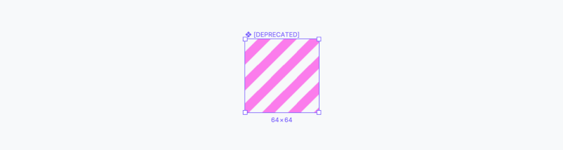
It’s a translucent tiling image with a harsh pink color we don’t use elsewhere in our branding. We drag it into the component and set it as the top-most layer, resize it to fill the frame, and end up with a deprecated component no one will accidentally miss.

Make sure to set the constraints to all edges to account for instances that have been resized.
2. Make deprecated components even more visible
While this layer makes it pretty clear on the canvas, it’s less clear in the layers panel unless you have the component expanded. So to be ultra-clear, we rename the layer to include a warning emoji and a big all-caps DEPRECATED to the end of the component name.
(Tip: On a Mac, CMD+CTRL+SPACE brings up the emoji picker. On Windows, it’s Windows key+; to do the same.)
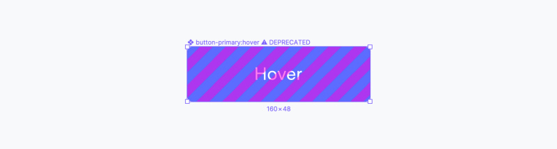
We add it to the end of the name rather than replacing the name so that other designers can easily tell what component it was so that they can more easily locate a newer version.
3. Publish your component
I’m not entirely sure this step is necessary, but to be very explicit about it I publish this visible version first, before deleting the component. If you wait a few days before going onto the next step, you’ll also give your team time to notice and give you a heads up if they really don’t want a component deprecated for one reason or another.
4. Delete your component
An earlier version of this article contained the following guidance for this step:
Once you’re confident in your decision, delete your component and “Remove from library” when you’re prompted during publishing.
Though since publishing, it’s come to my attention that deleted components don’t have previous updates pulled consistently, so my recommendation now would be to move these to a ⚠️ Deprecated page, and leave them there for whatever period you feel is appropriate for changes to propagate through your team’s working files.
5. Other considerations
Auto-layout: We first developed this approach before auto-layout existed. This won’t work for components that have an auto-layout set on a component, as any component added would be put into the auto-layout flow, rather than being placed on top of the other layers. The workaround for this is creating a Fill style with the same tiling bitmap, and replace the component’s fill with that style.
Communication: Always communicate your intent to deprecate something to your team well before you decide to do so. You can explain your reasons why, and tell people what to use instead. This is difficult to do in a purely systematic way using Figma right now. Maybe in the future, we’ll get component versioning with visible changelogs, or team-wide component replacement features that will make this easier to manage.
Maybe someday, Figma will make the finely-crafted notes you write when publishing updates actually visible when people review and pull in those updates, but until then, talk to your team (or Slack them).
It’s one approach: This approach may or may not work for your team. Try it with something small, get feedback, and iterate. If you’ve used similar, or completely different approaches to achieve similar results, let me know in the comments.
Thanks to Charlotte, Mark, and the Onfido Design Team for helping make this post better.