
Personalizing your own web experience
Issue 14: Exploring the tension between standardised and tailored experiences


I was a HUGE fan of Google Inbox when it was launched (well, more accurately I was a fan of the idea of it from launch, and became a fan when they allowed G-Suite accounts to finally use it a few years later). It stripped back my inbox to a simple list of emails, and enhanced that list with useful peeks at the content and attachments inside, the ability to snooze emails, or mark them as “Done”. It was intentionally minimal, designed from the ground up, and was simply my favourite email experience to date.
In 2018, Google announced it was shutting down Inbox, and focussing their efforts on bringing their learnings to the core Gmail experience. Some stuff made it across in some form eventually, but individual features weren’t actually what I valued, the core simplicity of the experience was.
Without many viable options, I begrudgingly switched back to Gmail and just kept using it, but was always on the lookout for decent alternatives, or native apps that suited my needs better.
In the last year, I’ve found myself using more and more services that take existing web experiences, and customize and tailor those products to fit my needs better, thanks to the power of the open web. It got me thinking about personalised experiences, monetization, and design intent in a way I hadn’t before.
Simplify Gmail
Late last year I discovered Simplify Gmail. This browser extension, created by Michael Leggett in 2019 (one of the co-founders and the design lead for Google Inbox) injects custom code on top of Gmail, changing the live Gmail interface into one that’s simpler, easier, and more delightful to use. It’s packed with options on what to show, what to hide, and plays nicely with Gmails own settings and preferences, even enhancing how those settings are displayed.

It costs $2 per month per user (one user can have up to 10 Gmail addresses), and for me at least, successfully bridges the gap between the email experience I want, and the one Google are incentivised to push on me. I don’t want Google Chat. I don’t want Spaces. I don’t want Google Meet. I want to check my email, with as little distraction as possible.
Minimal Twitter
Minimal Twitter is another similar extension I’ve started to rely on recently. The model here is a bit different, but the intent is the same: Reduce the noise of Twitter’s current UI to a core timeline experience, with a ton of options to turn on and off the parts you want. Don’t engage with trending topics or follow suggestions? Turn them off. Want a completely minimal UI for focussed writing? Sure, you can do that too.

It’s developed and maintained by Typefully, who offer the extension for free, but use it to advertise their own product (in a pretty unobtrusive way).

Arc Boosts
Arc Browser (My #1 app of 2023) has an approach it calls Boosts, which are effectively just a wrapper for user-created CSS and Javascript injected into sites like the extensions above. I’ve used user generated CSS in the past to help me visualise component and style usage from our design system in live products, but have recently converted those styles into Boosts as well.
Boosts sit at the same level in Arc’s UI as Extensions, and it seems to be that Arc is headed in the general direction of having some sort of store or community for sharing these Boosts in future.
Right now, people are using boosts to create minimal versions of sites, removing features they don’t need, making Github look like it was designed in 1998, or even slowly fading an animated gif of Guy Fieri over every image in their browser, in an attempt to reduce their own internet consumption.

My own history with UI customization
I’ve always been interested in personalizing my own interfaces. I remember installing LiteStep on Windows 98. LiteStep was a replacement window manager that let you customize the positioning, placement, and skinning of everything to do with your windows desktop. People were creating “futuristic” (at the time, lots of 45 degree angles and bevels) interfaces with micro-text, media players built into the core UI, and custom menus that sorted your apps and games into fly-out menus. It was basically winamp skins for your desktop. The problem was none of it was very flexible or dynamic. Most things were image based, so to add a new menu item you needed to create new images, modify scripts, custom position everything to make it fit, it was a huge hassle to maintain.

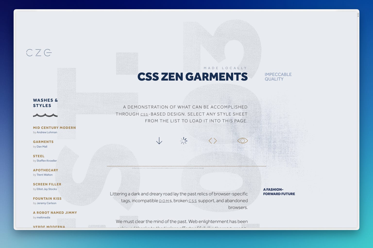
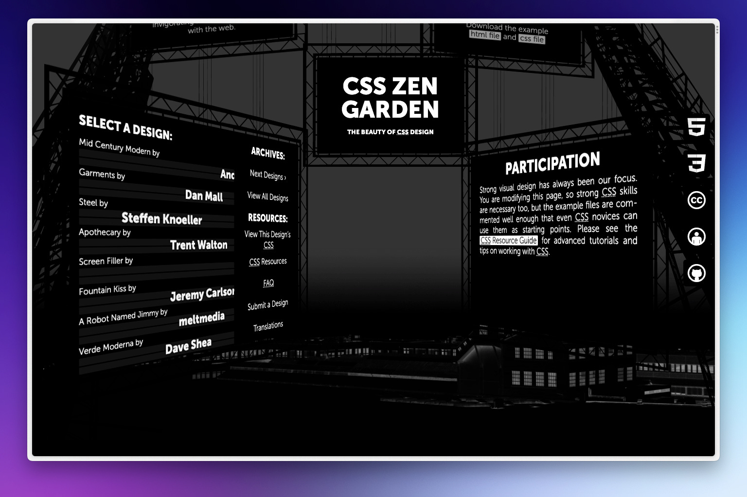
A few years later in 2003, the CSS Zen Garden was launched, and I remember browsing it for hours, impressed that a single HTML file could be represented visually in so many different ways by just switching out the CSS. It was a promise of a future web that never really came to fruition.
The user need for more dynamic experiences was stronger than the pull for tailored ones, and structured semantic markup was replaced with minified classes, and javascript frameworks with single-page rendering. The barrier to customization became much, much higher.
User needs and business goals
As a designer, I try to design things thoughtfully and with intent, to balance user needs with business goals. I try to account for edge-cases as much as possible, but some user needs are simply at odds either with other user’s needs, or with business goals. So what should happen when those clashes occur?
“As users, we are at a supreme disadvantage in the battle for our attention. Our time, attention, productivity, and joy are invaluable and they are worth fighting for.”
- Excerpt from Simplify’s statement of purpose
Open web technologies enable remixing, reinterpretation, and accessibility in ways that native platforms often struggle to. At small scales, it seems ethical (for me at least) for individuals to be able to modify and tailor their digital experiences in a way they see fit, if the tools are available for them to do so. But these modifications come with a cost. The designers of these sites or apps don’t know what changes users are making to live sites, so when they redesign things, those customizations might break without warning.
The beauty of these extensions, designed and maintained by others, is that they handle that maintenance burden for you, and make these kinds of experiences more accessible to those who don’t understand the coding side, or who simply don’t have the time.
The flip-side is that these customizations often reduce the ability for the businesses behind them to monetize in the way they want to. Hiding ads or sponsored placements is a common one. Then, if the customizers seek to either advertise their own products on a site that hasn’t granted that permission, or monetize directly, it feels like things get a little more ethically murky.
I don’t know what will happen next. The pool of users doing this at the moment is pretty small in the grand scheme of things, and aren’t a threat to business models yet. Both the extensions I mentioned about have about 30-40k downloads on the Chrome store. At this rate, I don’t expect there’s much of a reason for companies to put scarce resources into allowing more customization (for a price?).
What I’d like to see perhaps, is a model that allows a revenue split between the customizer and the company who’s app they’re building on top of. Regardless, I’m probably going to keep using extensions like this, flying somewhat under the radar, and hope that tech or standards advancements make designing, building, and testing highly customizable interfaces easier and cheaper in future.
What about you? Do you modify web experiences in ways the designers didn’t intend?
Editor’s note: Thank you all for waiting an extra week for this issue. I’d been living without a working fridge/freezer for two and a half weeks, and it turns out that has a lot of knock-on effects on one’s free time! At the end of the day, I’m sure many of you are subscribed to a bunch of newsletters, and I’d rather you get something high quality rather than rushing something out to hit a self-imposed deadline.
Thanks for reading! - Steve
Elsewhere
Pat Morgan of the Better by Design newsletter (check it out) has a great article on Prototyping to communicate, not complicate. He shares his thinking and approach to creating prototypes in Figma (and when not to), as well as some top tips to make your prototypes better for communication.
The Browser Company released a new Arc update this week, and with it came a full, mostly-unedited design review meeting between Dustin the head of design, and Josh, the CEO. It’s refreshing seeing this kind of transparency in product development, and if you’re paying attention to Arc, there’s some great indications of what direction they’re heading in and how they approach decisions. I found it really inspiring.
Thanks for the shout-out, Steve! 🙏