The playful design details of the Playdate console
Issue 16: A showcase of delightful details with questionable ROI.
If you’re not a gamer, there’s a good chance you haven’t heard of the Playdate.

It’s a little yellow gaming console with a crank, that fits in your pocket.
Despite what many initially assume, the crank doesn’t charge the device, it’s used as an analog input to control aspects of the games developed for playdate. It has a 1-bit screen, that’s pixels that can just be black or white, no greys even, and there’s no back-light. It evokes the early versions of the Gameboy in that you need to be in a well lit space to play it, or have some kind of reading light. It’s an odd choice, that you’d think would limit the potential audience for it, and you’d be right. It’s one of many decisions that add up to a device that’s unlike anything else, and oozes personality.
The Playdate is a weird niche hardware oddity created by Panic, in partnership with Teenage Engineering. Panic are known primarily for making Mac software for web developers (Transmit, Coda/Nova), though they do have some overlap with gaming, having been the exclusive makers of apparel for the Namco game Katamari Damacy at one point, as well as publishing indie darling games Firewatch and Untitled Goose Game.
Panic have never made a digital hardware product before though, which is part of why the Playdate product stands out so much against the competition. It’s a device full of delightful design choices, which all add up to something that’s more than the sum of their parts.
In the rest of this article, I’m going to highlight some of these delightful details, but if you’re planning on picking up a Playdate, I consider these to be spoilers for the Playdate experience. It’s far more delightful to be surprised by these things in the moment.
SPOILER WARNING FOR THE PLAYDATE EXPERIENCE
Unboxing & Introduction
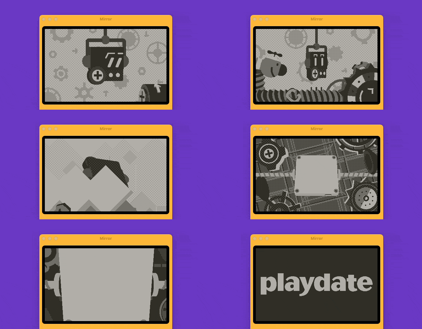
The Playdate arrives in a small box, matching the Playdate’s distinctive yellow and purple color scheme. The device is mounted at a slight angle in the box, indicating a little playfulness right from the word go. You turn the device on, and are greeted with a beautiful interactive animation that walks you through clicking the directional inputs, the A and B buttons, and the crank to familiarize yourself with the inputs.
It’s also a showcase of the screen, which without any words says “Hey, I may only be black and white, but look at how smooth I can animate, and how much variety you’ll get with these limitations”.
To unlock the playdate, you press the lock button twice. The animation here gives you feedback by showing the device ‘asleep’ with two closed cartoon eyes, and each click of the lock button opens one eye and the device wakes up.
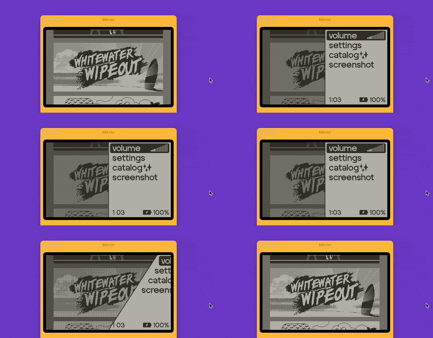
Even the operating system has delightful touches. The system menu has a beautiful, high frame rate angled swipe in from the side after pressing the menu button, making it feel fun to press.
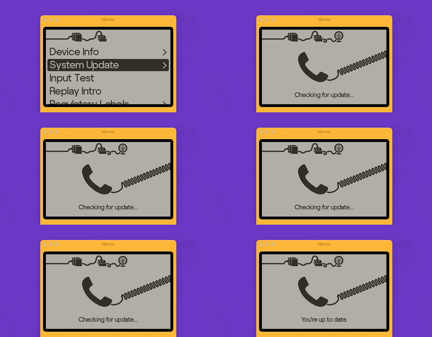
The settings menu is intentionally utilitarian, but even that has a little illustration of various plugs, cables, and gadgets that act as breadcrumbs to show you how deep in each menu you are.
Christmas morning
The majority of games for Playdate are made specifically for the device, and you can’t play them on anything else. When you buy the device, you get a “Season 1” of games that come as part of your purchase price, but the catch is that you only get two games unlocked each week on a Monday, up to 24 season 1 games after 12 weeks.
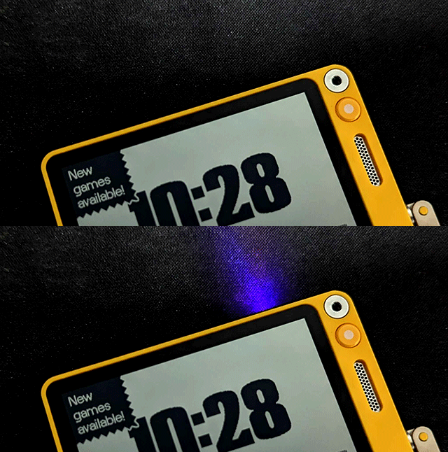
The design intent is to surprise the user, as well as not overwhelming them, and it works incredibly effectively. Mondays feel like Christmas morning. You wake up, and will be greeted by the lock button flashing purple, indicating new content is available.
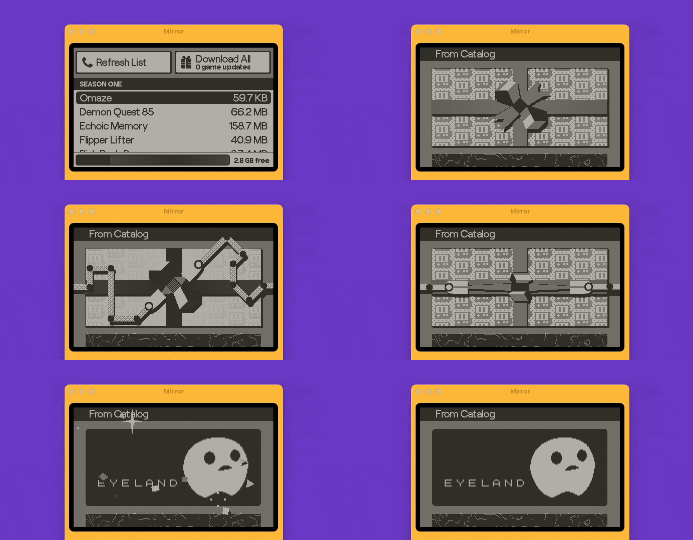
You unlock the Playdate, and see a game tile, wrapped in digital gift-wrapping. A quick tap of the A button causes two little robot arms to appear, and untie the bow on the gift-wrapping, exploding in confetti and revealing the tile art of the game you just unlocked. This happens each time you add a new game to the device, whether through a season, purchase, or side-loading.
Buying new games
In the last week, Playdate have launched their on-device store for buying one-off games alongside the seasonal games. It’s called Catalog, and is clearly the team leaning into the playfulness to an even greater extent.
Once you load Catalog, you get a beautiful looping page-turn animation that continues until the store content is loaded.
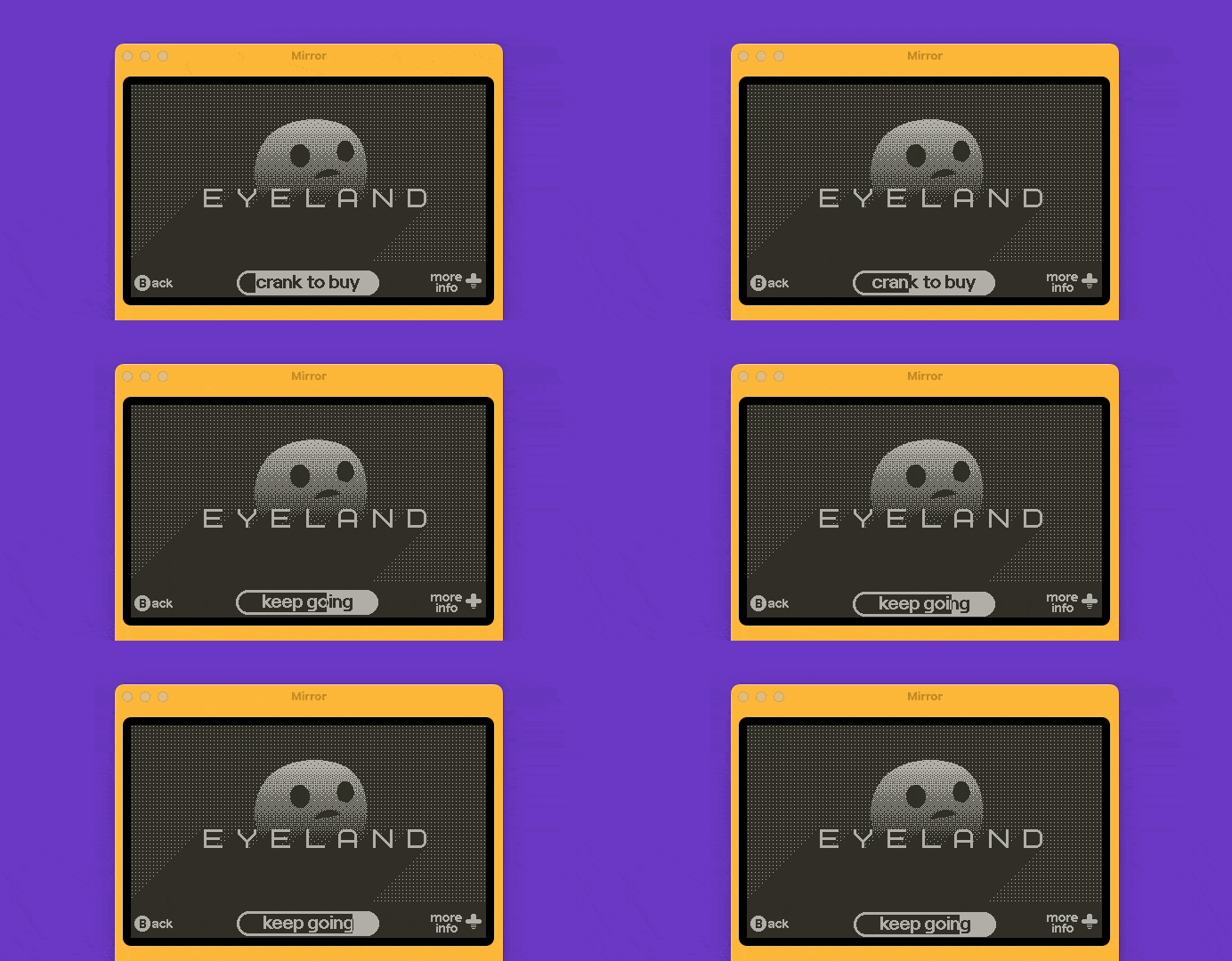
You browse the beautiful 1-bit store art, click in to a specific game to see screenshots and learn more about it, and then press A to buy. The button text changes, and now reads: “Crank to buy”. You flip the crank out, with its delightful little sound effect, and start crankin’. The button fills up, fast at first, and then slower as the perceived “tension” increases as you get closer to confirming your purchase. Finally you fill the button up, and are greeted with another explosion of confetti.
(note, that crank to buy is totally optional, and pressing A a second time will also confirm the purchase, just in case the crank is an accessibility issue)
But that’s not all. The piece of experience design I most appreciate, that no other game store I use does, whether Xbox, Steam, or Epic: The line on my bank statement includes the title of the game I purchased. Brilliant.
So, what can we learn?
The Playdate’s delightful details don’t have any measurable ROI on their own, but as a whole, they add to the overall experience a user experiences when they buy the product. Cute, playful, and delightful. As designers, most of us won’t ever work on a product where this much playfulness is expected, so don’t add random confetti explosions to your B2B accounting app just yet… In fact when you’re done here, read this great article on the dangers of delightful design for balance.
But taken in the right context, there are great design lessons to take from this that can be applied to most products:
Pay attention to onboarding. Introduce people to your features in a way that isn’t just asking them to read an online manual. Make it interesting. People often learn by doing.
Smooth out the edges. Little annoyances like unlocking a device or logging in to a web app can have little details added or removed, to make the experience smoother.
Make things simple for your users. The playdate is an aggressively simple device, which Panic were only able to achieve through a series of incredibly complex decisions and tradeoffs (that you can hear about in their Podcast episode). Put the time and effort in to make things simpler for your users, which usually means more complex for you.
Embrace your constraints. On paper, releasing a gaming console with a 1-bit screen that needs games made for it specifically, doesn’t make a whole lot of sense. Those constraints can be used to add character, and make a product that stands out from its competition.
Elsewhere
Links and resources from around the web.
Daley Wilhelm writes about how Sparkles aren’t good UX ✨ (despite the sparkly confetti I gush over in this issue)
David Hoang of
writes about building better products by playing videogames. Also very relevant to today's issue!
If you’ve been confused/stressed by the Silicon Valley Bank news this weekend, and not totally sure what happened or why, this TikTok is the best explainer of the situation I’ve seen.


