Ways to use AI in product design today
Issue 7: Existing and future use-cases for AI in web and product design
As I wrote about last week, AI text-to-image tools can feel ‘magical’ at first glance, but have many problematic aspects in their data sourcing and implementation right now that require solutions (and law updates) to make them more ethical and viable to use for commercial work. If you are happy avoiding producing full-blown illustrations with these tools, there are plenty of more ethical, smaller ways to include them in your process for product or web design.
Here are a few you can use today, and a couple of directions I could see things evolving in future.
Avatars for mockups
If you’re designing any kind of app with profiles or a social element (which let’s face it, are a lot of consumer-facing apps these days), then avatars are likely something you work with quite a bit. It can sometimes be a bit painful to get realistic looking mockups with placeholders or stock photo models, which is where AI can help. A website called This Person Does Not Exist uses AI to create unique faces that aren’t owned by any particular human. One caveat here are that you have to generate quite a few to get a good diverse sampling of people. They seem to skew white/asian quite heavily, and are only as diverse as their underlying data sources.

Background removal
While these products don’t utilize any of the newer prompt-to-image tech, AI has been assisting with the often tedious job of background removal for some time now. While there are good tools in Photoshop to assist with this process, if you’ve migrated to Figma and left your Creative Suite license behind long ago, there are some good web based services that will do AI-assisted background removal with very little manual effort.
One example is Removal.ai. Here’s a test I did using a photo from Godisable Jacob via Pexels. You can see it does a reasonably good job with notoriously tricky hair, but also removes a hand accidentally. Not perfect, but most of these tools have editing functions too for fine-tuning.

Hero image aspect ratios
Here’s a scenario you’ve probably run into if you’ve designed websites over the last 10 years. You have a wide hero image at the top of your page. You find some appropriate images, but either the aspect ratios are portrait, making them unusable, or the hero image is framed where the subject of the image would have it’s top or bottom cropped off. You resort to fading a gradient to a solid color to make the image wide enough without looking ridiculous.

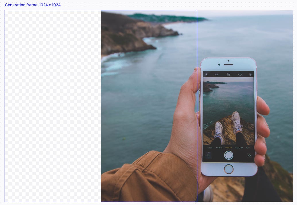
Enter DALL·E. While this tool is primarily for prompted image generation, it includes two critical features, called “inpainting” and “outpainting”. These allow you to “fill in” either an area within the image with a (hopefully) seamless addition, added via a text prompt, or extend the image beyond the initial frame in the same way. The images used don’t need to be AI generated to start with, we can start with our photo above.
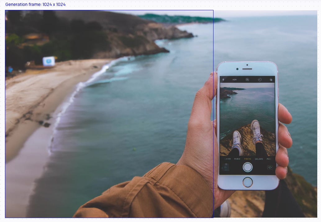
Moving the generation frame to the left, added a prompt, something along the lines of “beach coastline, out of focus” and the outpainting filled in the blank space with more coastline (and a little additional sleeve).
It tries to match the new image to the colours and shapes already present in the image to seamlessly blend things together. I repeated this a few times to get the width required, but it created me a beach with way too much rubbish and visual noise.
Inpainting to the rescue. I re-prompted with “beach, clean golden sands” or something similar, and ended up with an image ready to use in my website.
Despite my reservations about the sourcing of training data, I find this type of prompting, where the core of the image is still human-created to be much more ethically sound.
UI copy suggestions
Content designers are not easily replaceable by AI and are an incredibly important piece of mature design teams. They’re also in my experience the piece that many design teams lack right now, and these teams often just have to do the best they can with the resources they have. This means in practice, product designers often write a lot of UI copy, particularly things like error messages, alerts, notification text, etc.
Text AI tools like ChatGPT don’t yet know your content guidelines (if you have any) or know how to make things consistent across a site or app, but they can be good for initial drafting, or first-pass refinement of shortish paragraphs.
Here’s an example of shortening some existing UI copy using ChatGPT:
Prompt: Rewrite this to be shorter: “You can use webhooks to be notified about events that happen in your account. Webhook URLs must use HTTPS. You can find more information in our documentation.”
Output: “Webhooks allow you to receive notifications about events in your account. Webhook URLs must use HTTPS. See our documentation for more info.”
If we run the same command on the output text, we get:
Output: “Use webhooks to get notified about account events. HTTPS required for webhook URLs. More information in our documentation.”
None of these are quite right, but they can give you some ideas for how to shorten these sentences coherently so you can pick and choose the best bits from multiple passes. If you were really optimizing for space, you might manually rewrite an additional pass of it to be:
Rewrite: “Use webhooks to get notified about account events. HTTPS required. See full documentation.”
My main tip here is to never just use the output as-is. You still need to use your judgement for context and consistency.
“Magic Copy” is a feature of Diagram’s Magician Figma plugin which does a similar thing, though I think all the existing ethical caveats of whole-cloth image generation still apply to their Magic Image and Magic Icon features.
The future
It’s pretty easy for me to imagine a future where new AI-enhanced design tools use future generations of something like text-to-image generation, but trained on structured design file data that includes layers, frames, vectors, text, etc. In my opinion this would still obviously need to be a data-set with opt-in ethical data sourcing.
From here, maybe we say:
Create a homepage template for a travel photos app called WorldView
Maybe we generate 4 or 5 options in a matter of seconds, choose one we like, and then re-prompt with some additional direction:
Change the visual style to be more 60’s vacation photo inspired, with {brand color} as the primary color.
Change the hero text to something a bit shorter and with a more engaging call to action.
Remove the “About us” navigation item, and increase the spacing between the rest of the nav items.
Replace the slideshow section with something more accessible.
I think this kind of prompt-driven design would need to cater for fine-tuning and iteration in prompts, where it recognizes what’s being referred to, and can edit and adapt as needed.
This doesn’t fully get rid of the designer, though given how much it might speed up certain parts of the process, it will surely have an impact on the job market.
I’m not sure if this version of the future is exciting or terrifying (maybe a little of both), but either way, with the way things have progressed in 2022, it feels kind of inevitable, and it’s partly up to us as designers to help shape what that future could be.
Elsewhere
Multi-talented artist, director and illustrator Dave McKean talks about the impact of AI on the art world.
A collection of Design System Advice collected and written up by Mike Aparicio.
A product manager’s 64 insights from 2022 by Adrian H. Raudaschl (an epic piece with a ton of valuable links).


