Design System Breakdown: Button
Issue 3: Part 1 of a deep dive series on specific design system components
I’ve been toying with the idea of more in-depth breakdowns of specific components in Castor for a while, and the humble Button seemed like as good a place to start as any. Here I break down some of the thinking, tradeoffs, and decisions that went into designing and developing our Button component. Let me know if you’d like to see more articles like this.
Design goals
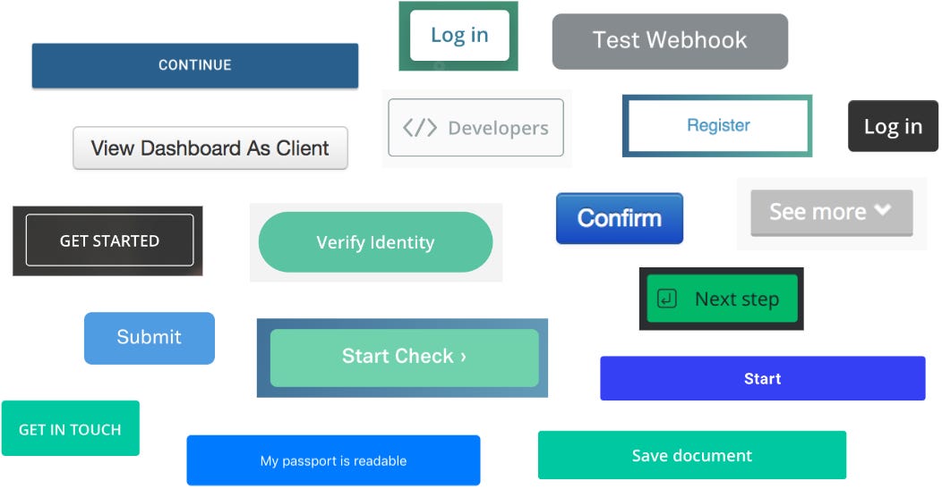
The iteration of our buttons that I’ll be focussing on here are actually based largely on an earlier iteration of our design system. This first version had already done a lot to reign in the chaos of having no design system at all (pictured below), but design tools weren’t aligned with code, and many systemic and design aspects such as accessibility, dark mode, weren’t considered.
We had broadly aligned on a general visual direction in V1, which provided a solid starting point. Buttons that looked like the ones below were already implemented across a handful of our existing products, albeit inconsistently and with no shared code. The general style of the buttons below were retained, but refined and expanded.
Our goals for this phase of the project were:
Improve consistency across products
Raise the bar for accessibility
Fit easily into existing products (with active development).
Accessibility
I’ll start with accessibility first, as it was forefront in my mind and ended up driving quite a lot of our key decisions.
Touch area
The biggest, and probably most unpopular decision we made was removing height/size variants from the new system. Our products span desktop and mobile, and minimum touch areas were a thing we’d been doing badly (surfaced in on our manual audit, which I wrote about previously). We’d had small/medium/large button variants which changed text size and button height, but given there were no good guidelines around when to use what, people were often optimizing for what looked pleasing to a designer, which in general is really quite small.
To try and counter this, we specified a single minimum height for interactive controls that would apply system-wide. It’d reduce the number of variants we needed to maintain, and hopefully act as a bit of a forcing function to get designers to reconsider and recalibrate our brains as to what “looks good”.
We’d specified an 8px grid for the system, and due to the minimum touch size on most platforms being specified as 44px, we opted to round up to 48px. Now, this is really quite large for most systems, especially desktop ones. While only strictly a criterion for AAA WCAG compliance, it felt like a solid and sensible future-proofed decision in a world where the line between desktop and touch-device were becoming more blurry every day.
We built the component to be easily resized vertically by hand in Figma (as well as the code counterpart), but with the caveat that responsibility for accessibility would be taken on by the designer implementing that button. This was a middle-ground approach that proved to be used surprisingly little.
Focus state
Our approach to focus states I haven’t seen done by many other systems, so I’m really interested to hear feedback from others on whether it’s a good one.
When designing our focus states, we adopted a couple of guiding principles:
It should be clear at a glance what element is in focus
Focus is useful for everyone, don’t suppress on mouse click or touch
Contrast should be high regardless of variant or background
Though not an accessibility concern as such, a bugbear of mine with focus rings has always been z-index issues and unintentional cropping from containers with overflow hidden/auto properties. They’re often a pain to work around, and a lot can happen during integration, outside the system itself.
After some attempts trying to fix these, we just asked ourselves the question, why not have the focus ring inside the element? This ensured that if the element was visible, the focus ring would always be fully visible too. We opted for a thicker border (3px) to differentiate it enough from the secondary button default. No other line in the system is this width, so it stands out visually a little more. To get the contrast we needed on the primary button though, we needed to add a second inner white border.
In Figma, this unfortunately added a little complexity. Figma (to much frustration) doesn’t support borders of multiple widths on one element, so we had to add an inner nested element and apply two borders, one 3px and one 4px to achieve the effect. I’ve since seen people achieve this with a border and an inner shadow with no blur and a high spread, but sadly when we created these a few years ago, Figma didn’t support shadow spread either. You live and learn (and hope for better change-management features in Figma one day).
This was around the point in development that we decided not to try and hide the focus ring on mouse click. To get comfortable with this, we had to ensure the rings felt contextually appropriate, and on-brand.
We chose to make the rings 1 step darker on our palette for contrast, and to offer two main variants to match our Action and Destructive buttons.
I’ll no doubt touch more on how these decisions impacted other components in a positive way in future installments of this series.
Note: In doing a bit more research for this article, I see that Carbon design system actually has a similar double-border approach, with the addition of animating the transition, which is a super nice touch.
Dark mode
This was the hardest part of the process by far. Onfido had a variety of products, some of which were designed in dark-mode only, and some that were light-mode only. We wanted to the system to support theme switching, and had architected our design tokens with that in mind. The main problem wasn’t a technical one, but a political one.
As we were aiming for easy adoption of this big new system refresh, we needed to strike a balance between changes that would require work from designers to integrate properly (such as the minimum heights), and tradeoffs of building some legacy decisions into the system so that there wasn’t too much change all at once, that might hurt adoption.
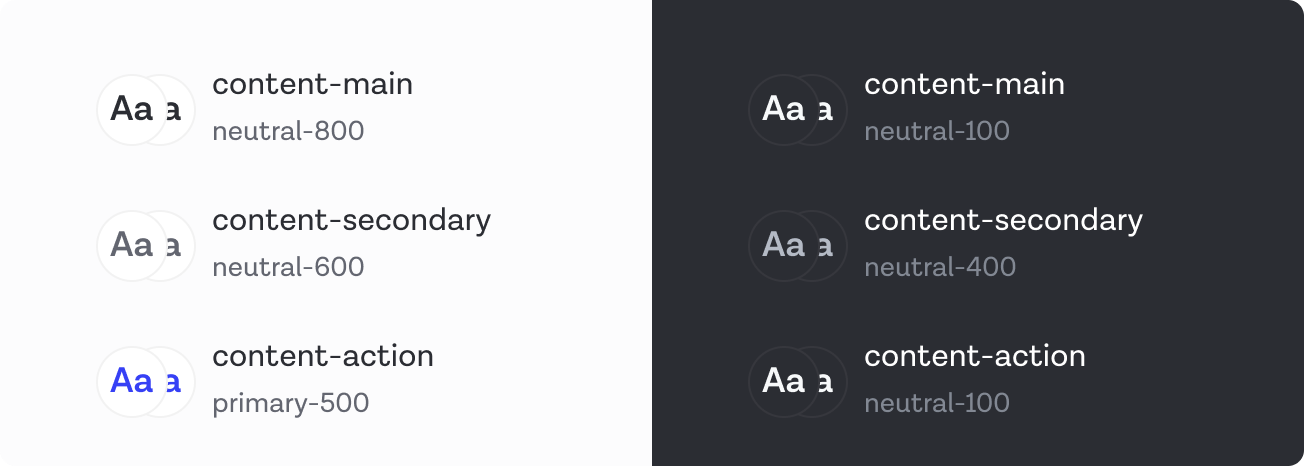
The decision was that in dark mode, our primary button color switched from blue to white.
Because we hadn’t architected our tokens with a component tokens layer, all our components were built with semantic tokens. (With the benefit of hindsight, this was one of my five biggest design system mistakes).
On the one hand, I can see that absolutely white stands out the most on a dark background, and is unequivocally the primary action, the problem was more in the knock-on effects. For example in switching the “Action” color to be nearly white, you lose any differentiation between actions and the main text color, which is also nearly white. You can also see in the image above that the Tertiary button could easily just be mistaken for standard text, which is a problem.
This tradeoff caused a lot of headaches, but ones that could have been better mitigated with either more time spent on conversations, or possibly leaning into a component tokens layer, where knock-on effects on other components are a lot more limited.
Icons & Variants
We have a few configurable variants and properties on our buttons.
Icon [none/before/after]
Kind [action/destructive]
Variant [primary/secondary/tertiary]
State [default/hover/pressed/focus]
Disabled [toggle]
All of these have parity with code, except for the icon. After a lot of back and forth, the engineers decided that they’d implement icons not as properties, but by allowing the text of the button to be composable with our icon component. This isn’t easily recreated in Figma, but the code looks something like this:
Given that icon-only buttons have additional accessibility concerns, we chose to split IconButton into a separate component.
Again, for ease of adoption, we included disabled as a property, to lower the barrier for that initial migration, but strongly advise against its usage for accessibility reasons. There’s almost always a better way to do something than disabling an input.
State isn’t strictly necessary for most screen design, and is among our least-used properties, but we did wire them up as interactive components, so hover and pressed states would automatically work in prototypes. This adds enough value to justify including them for us.
Base components
Note: In 2022 and beyond, I do not recommend using base components. They made the most sense for us at the time, given our limited resource for maintenance, and the maturity of Figma features at the time (no variants, no component properties). If you’re starting today, definitely lean into component properties, as they simplify a lot of things and can reduce your variants significantly.
I approached our base component as a variant set that only dictated the icon layout, and whether an icon was present. As this is added as an instance within each button component, it adds an additional level of nesting, which was what we needed anyway to make our double-borders work, so at the time it was a two birds with one stone situation. I made the colors a garish purple so that all production colors were specified at the component level as overrides. This made it a bit clearer exactly where you should set or change colors, as inheriting colors from a base component isn’t very transparent, and we’d run into maintenance problems related to that in the past.
Our final variant set you can see below.
I hope this has been an interesting window into our process, and you’ve learned some things in both what to do, and what not to do. If you found this helpful, please let me know in the comments, and whether you want to see more articles in this series.
Further reading:
Naming design tokens by Lukas Oppermann
Component level design tokens, are they worth it? by Nate Baldwin
A guide to designing accessible, WCAG-compliant focus indicators by Sara Soueidan


Thanks for sharing those insights about your process. It was helpful.
Thanks for sharing your details. An accessibility question came to mind: How do you distinguish the destructive buttons from standard ones for colorblind users?